Judged a book by its cover EVER?
I'm participated in a feature where you answer questions regarding books- I'm answering with book covers, not books as I dislike more book covers & it doesn't really reflect on the book. Some of these book covers are actually on fab books, others... Well, it's still the book cover I dislike :P
I've only actually read 5 of these books & they probably average 3 stars between them so proof it's dislike of covers.
 |
Feature hosted by Rita @ Weaving Pages
(if you're not a book blogger, you can answer them in comments) |
1. The end of the world is near, and you are packing a survival bag. Your only means of warmth is fire, and to start one, you have to use a book. Which do you choose?
My brain's seeing red, so chuck 'em is searing red heat.


I think the cover of Careless just doesn't appeal to me like the novel did because it looks crumpled. You "scrumple" up stuff to chuck it in a fire so this was my first thought...
Then I saw the middle novel's cover. Oh, yeah... Virgin. Purity. Character must be white & blonde. So imaginative. It's the combination that bugs me... Not only that but look, flawless face. Pearls... Beheading that close up isn't clever, chins, necks & busts don't really appeal to me.
And that hideous cover for a children's book- I own the one with a fractionally better cover. That cover, what even...? It's not fabulous, seems really evil & is extreme even in that genre! I wouldn't subject kids to that cover, fire... Yeah, maybe.
2. You have been walking for miles without shoes, and your feet are bleeding. In order to make shoes, you have to cut up your hardback book that you carry with you. What book do you carry?
I might need the padding this time but mainly the cover isn't to my tastes!


 Looking For Alaska because sure, it's unique but seriously, smoke? If I'd seen this cover I wouldn't have read it. I may not have liked the book but y'know, the cover is distasteful in my opinion as well!
Fifty Shades Of Grey's covers apparently became "standard". Stupid. I'd give this book away, not just the cover (I needed one exception, didn't I?) I know I wouldn't like it & I'm not an adult, so... Trolls, have this book (even though I don't own it, I'll send the ebook straight to the Troll ereader if they give me the e-address ;) I'm not even posting the GR link to that one.
ReEarth was quite good. Might've been typos and the like but I can look past that- I just wish the cover had a better design that intrigued me or gave some inclination to the web on Rhea. I can just imagine... But let's not, this is the cover & I'm not that impressed ;)
3. As you cross a bridge, a troll appears from under a bridge and demands that you give him a book. Which one do you give away?
As the covers which don't fit the book I really think I should give away...


 OK, Sugar Rush is an LGBT, not a chick-flick. Misleading, much? If the cover fitted the book, it'd be OK.
Girl, Aloud led me astray too. It's a lot more serious than that cover tells you...
It says on Invincible Summer's synopsis it's 'not your typical beach read'. It looks like it, it looks like a murder or something has happened... What? That could easily be a corpse in a crime scene according to my first impressions. Why do I want to look at a girl's figure with writing on her orange stomach and around her bum? Umm... let's think about this. If it doesn't say, crime scene it's implying something else...
4. After winning a gruesome fight, you have badly hurt your arm and you desperately need something to bandage it. Your only option is a book, which one do you use?
The book covers I'd use which have "issues".


 These are the bunch which seem OK at first...
The Medusa Conspiracy has pretty font but that girl? She does look stuck on, not like part of the cover. There's too much going on & she's just looking past us as if she's fed up of us, readers. "Too many readers have looked at me today, I'm just going to add bored..." She's too close to having "duck lips" for my liking... She glares at me if I turn the cover anticlockwise about... 70 degrees?
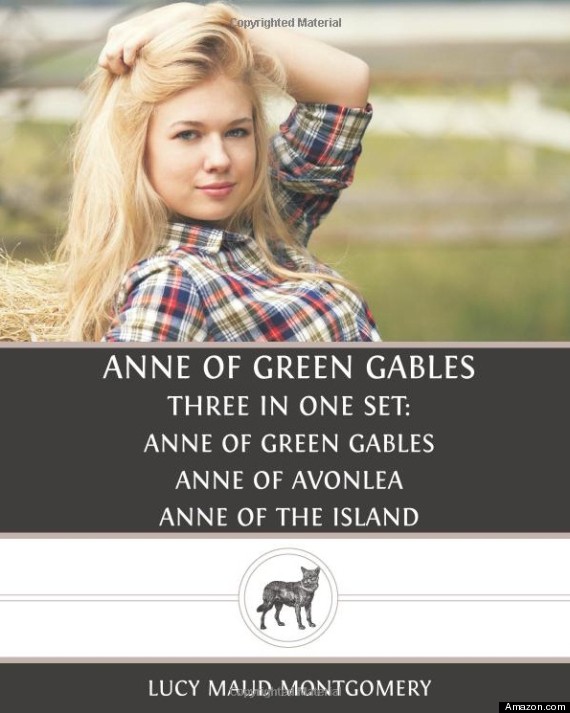
That Anne Of Green Gables cover has been publicly displayed as a joke. I'd like to concur. It's not that hard to find ginger's to model as Anne, so why settle for a fake blonde? I'd pose for it and I wouldn't insist on wearing clothing like I normally do if the book was set over a hundred years ago in the past... Simple. I believe this edition isn't up as it went out of print or something... I'd be sorry but it deserves it.
There are lovely covers for my last book cover today... But this one? Too many colours clashing & hurting my head. I've never seen anything like that... I don't wish to see anything like it again, either. Thank goodness it's only a kindle edition I own! :P
...Those the book covers which should be erased... Physically cut & stick if necessary.
Maybe don't... Bad advice.
I'm sorry for all unhelpful contributions- oops!
Amy Bookworm x


3 comments:
YAY! I'm soooo happy, and I loved all the covers you chose! I agreed with all of them!! xx
I agree with nearly all of these Amy, except Looking for Alaska and Super Sad Love Story, I quite like those ones. But I found this a pretty funny post anyway :)
@Rita: Aww, thanks (: I was really glad I could join in! xox
@Rachael: Yes, it was meant to be funny not bashing! Some covers mean different things to different people, it's perspective so it's OK you like those :P Thanks for stopping by!
Post a Comment